If you like this post, help us share it
Adobe Lightroom 4 is finally out of beta, you can get your copy from B&H for $149. ($79 with upgrade). The announcement was welcomed by many due to its attractive price. It is 50% cheaper than Lightroom 3 when it was first introduced. I have just received my copy and tested some of the new features, so far I like it.
If you don’t own a copy of Lightroom, this is the best time to get it. You can get your copy from B&H.
There are so many changes in LR4 and they are all over the web, I won’t relist them, you can check out the changes here.
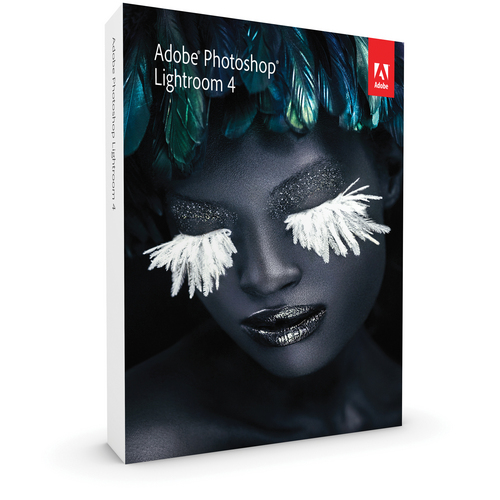
I had a smooth transition from LR3 to LR4, basically after the installation and entering of the cd key, it asked to convert the LR3 catalogue to LR4. The conversion took about 10 mins for me and I am all set.
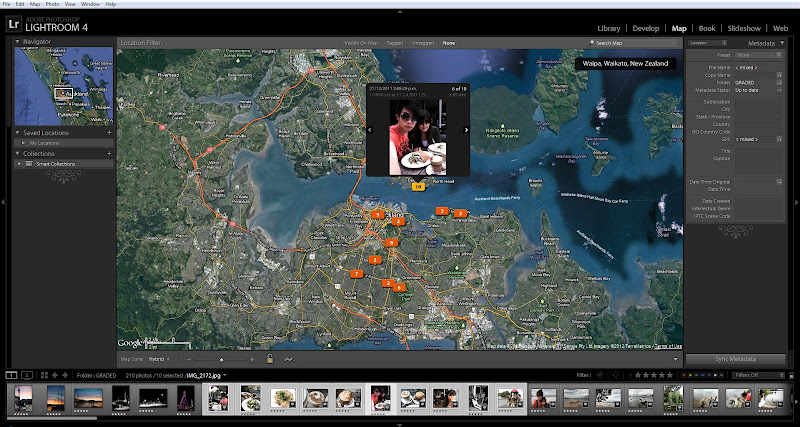
The user interface looks pretty much the same, except with some obvious additions like the new Map and Book Modules. You should notice all your settings remain unchanged if you have migrated from LR3.
If you have been using LR3, you will notice all of your photos have a warning sign at the bottom indicating the process (LR3) used on this photo is out dated. You can click the warning sign and update the process to 2012 (LR4). Alternatively, you can change the profile setting under the camera calibration tab in the Develop module. In doing so the photo will update to 2012 (LR4) camera raw calibration. The new 2012 (LR4) raw profile changes the image slightly, most significant to the highlight area.
So far, I only had limited time to play with LR4, so I can’t tell you everything, but here is what I have found.
In LR4, there are no more “recovery” and “fill light” sliders and there are no direct replacements for the sliders, since the algorithm behind all of the LR4 sliders have been changed. However, there are three new sliders introduced, they are “ shadows”, “ highlights” and whites”. Their functions are similar to fill light and recovery, but not identical.
With the adjustment brush you can now adjust WB, noise and Moiré on selected area. In the tone curve adjustment, you can adjust the curve on each of R, G, B channel independently.
There are two new modules in LR4: Map, where you can geo tag your photos and Book, where you can create a photobook and export to Blurb or PDF. I am not sure how useful is the photobook since most publishers supply their own free standalone software already, but the new Map module is a useful one where you can tag and see where all your photos are taken on a map. It works perfectly with iPhone’s geo tagged photos. I took some photos using iPhone on a recent trip and they are mapped in LR4.
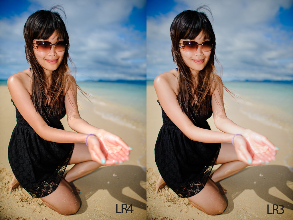
Based on my breif encounter with LR4, I have noticed LR4 has a much improved highlight recovery which is now adjusted through the “highlights” and whites” sliders. Previously in LR3, adjusting too much of the recovery slider can cause undesirable effect to the overall colour of the image, so you can’t apply too much of it. In LR4, the highlights and whites work much better and you can tone down the highlights quite a bit without affecting the overall image. Here is a comparison below, notice the over exposure on the hands is much better controlled in LR4
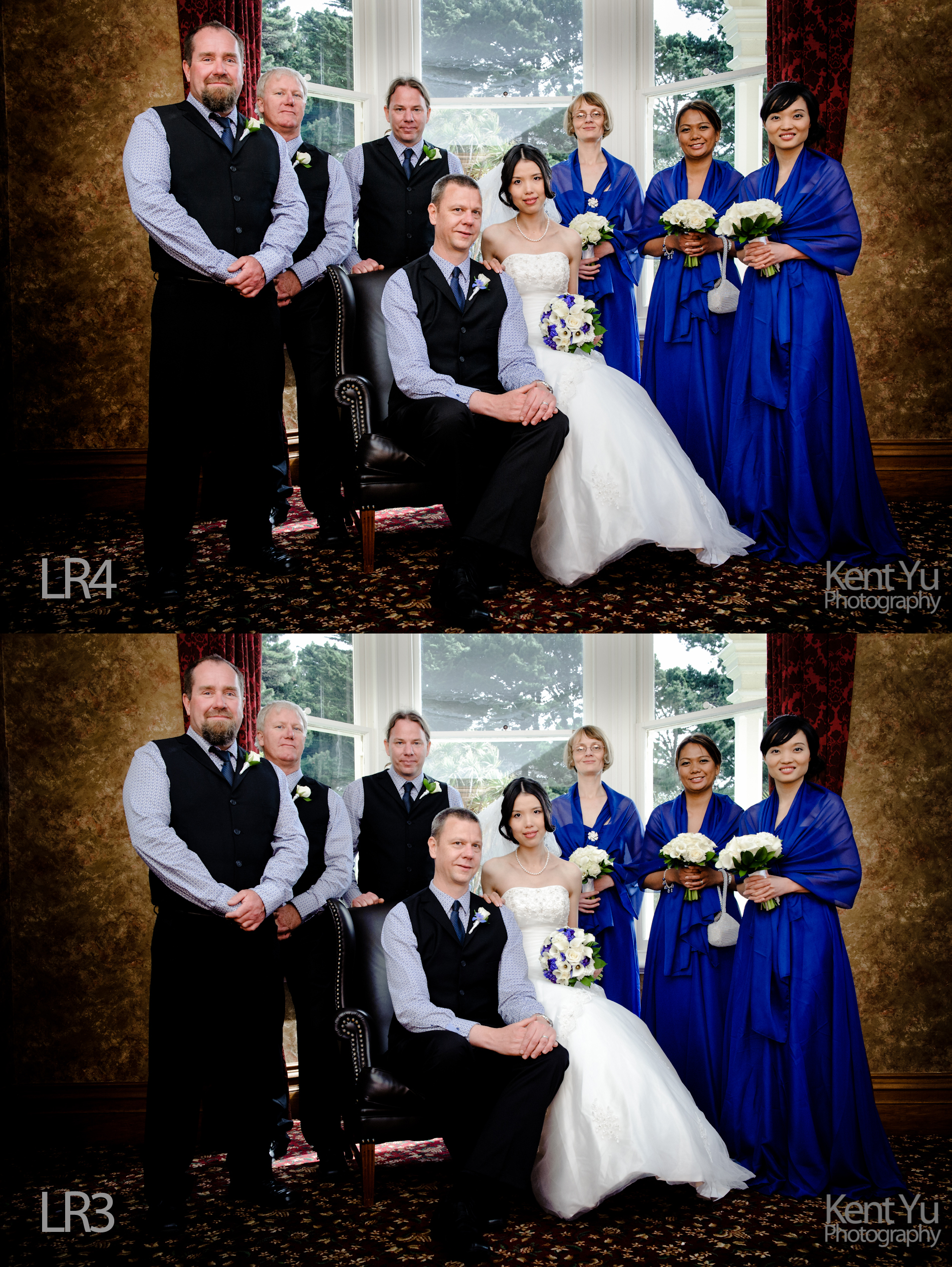
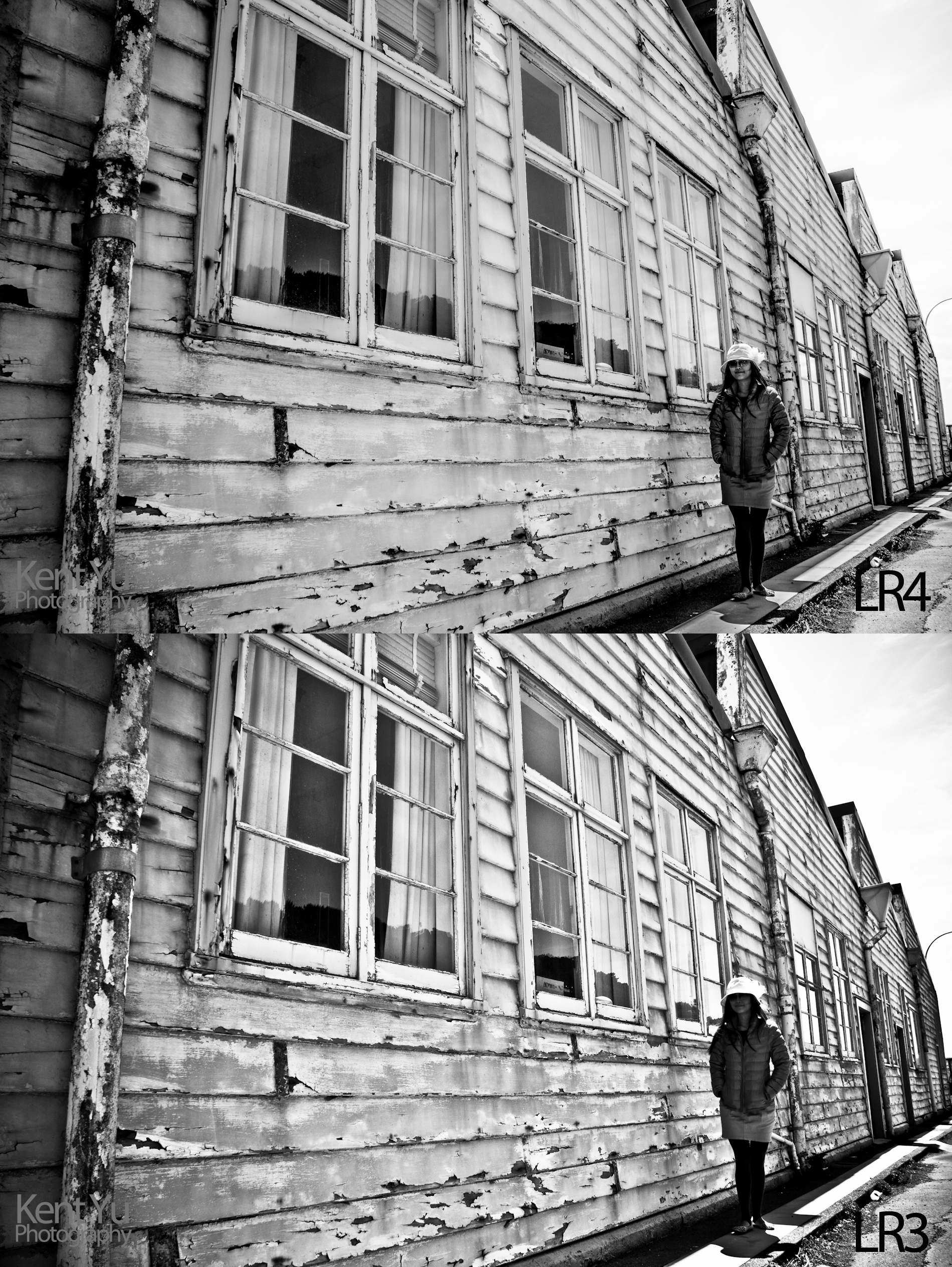
Here is another example of using some of the new adjustment sliders (highlights, whites and shadow ) in LR4. Notice how the highlights on the windows are better controlled in LR4. Also the shadow is better lifted, thanks to the dedicated shadow slider.
Another greatly improved adjustment is Clarity. Previously in LR3, if you apply too much clarity, you will get a halo effect in your image. This is no longer the case and you can apply as much clarity as you want. The clarity increases the “structure” of the image similar to the “structure” in Silver Efex Pro. Here is a comparison between LR4 and LR3 with 100% clarity applied to the image. Notice some halo effect by the windows in the LR3 image. The new shadows slider was very useful to lift the details on the face without affecting the overall image. In LR3, lifting the shadows on the face was harder to do.
Another important feature that I checked out is the Noise Reduction (NR). More on NR here. It seems that there is no difference in Noise Reduction from LR3 to LR4. Here is a comparison of noise reduction in LR4 and LR3. The image was taken with Nikon D700 at ISO 8000 with 30% NR. Original image here

Original Image at ISO 8000 with 30% NR
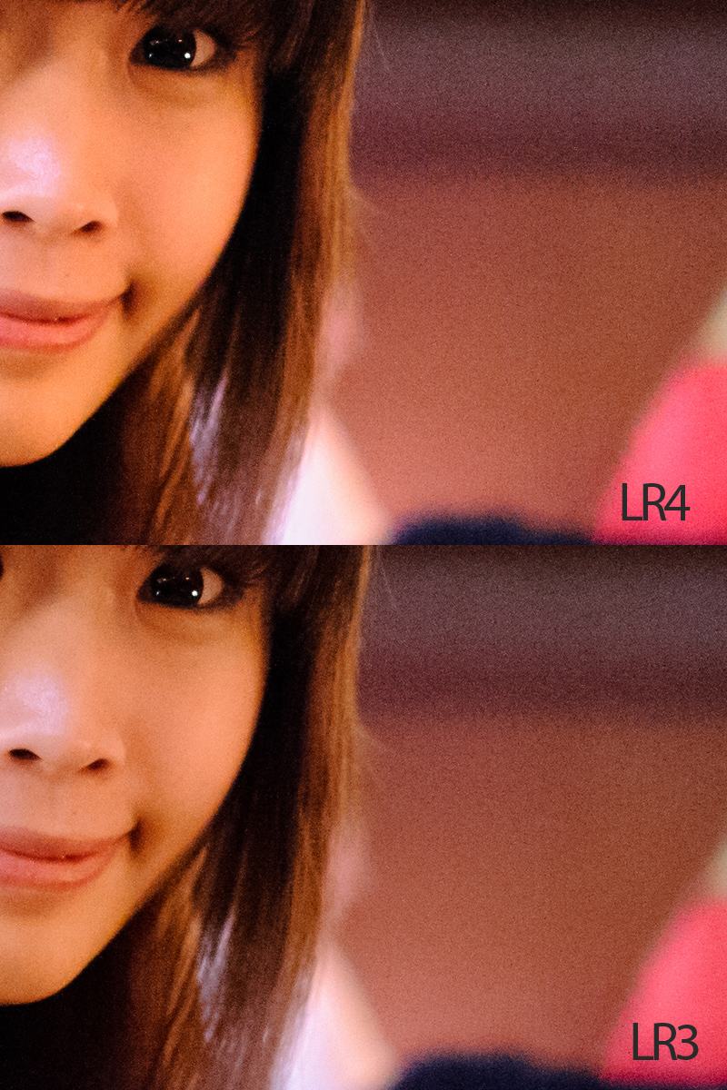
100% crop – 30% NR
Where can I find the equipment seen on this site?
If you find this site useful and planning to purchase any of the equipment seen on this site, please show your support by purchasing your photo equipment at B&H Photo Video, or through any of the affiliate links seen on this site.


I just upgraded, and was trying to decide if I should “Update to Current Process (2012)” for past entries. Thanks for the review, I intend to update the process. The noise brush is a welcome update, but Adobe still needs to get competitive with DXO or Noise Ninja.